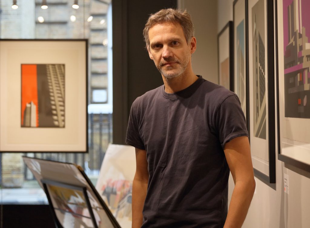
Creative Boom – Paul Catherall on growing up in Coventry, seeing buildings in colour and big breaks
This spring, the acclaimed British printmaker Paul Catherall returns to the South Bank for a major retrospective, spanning 20 years of his bold and beautiful linocuts.
Taking in old classics, including his now iconic prints of Battersea Power Station, the National Theatre and Tate Modern; commissions for high profile clients including the Southbank Centre, Royal Shakespeare Company and Transport for London; and new, more abstract architectural pieces, this show brings together some of Catherall’s best-known artworks and displays his signature style and movement to mastery of the linocutting medium.
Futures Past is Catherall’s ode to an ever-changing London skyline, from St Paul’s to Brutalist monuments, Modernist masterpieces and newcomers such as The Shard. We caught up with Paul to talk about the exhibition as well as his journey so far and what he has planned next.
This show is a major retrospective, spanning 20 years of your linocuts. How did you decide what to feature?
I wanted to show a range of the work I’ve done over the years and a bit of how it has developed, so my starting point was my first linocut on an architectural theme, Dome, of what’s now the O2. It was then still being built in the run-up to the Millennium. Then some old ‘classics’, which people frequently associate with me, such as my prints of Battersea Power Station and Tate Modern, which was my first poster commission for Transport For London. Along with those I’ve tried to get a broad range of personal favourites, like my Southbank Magenta, as well as book cover commissions and the odd figurative piece.
You mention Southbank Magenta as a favourite piece. Can you tell us a story behind this?
Well, I first tackled it as a small print in 2000, which sold out, then revisited it at a larger scale a couple of years later, which again sold out quite quickly. I’ve come back to it on an even larger scale for this show. It’s of the National Theatre, which is probably my favourite piece of architecture. The view is from the side and it creates an almost abstract composition without my having to use too much artistic license. The beauty of the building did all the hard work for me!
Another favourite is ‘Festival II’ – an image of the Royal Festival Hall commissioned by the Southbank Centre. It was a real struggle to get the right composition and I laboured for weeks with various sketches and painted roughs but got there in the end. It’s definitely a case of my motto ‘less is more’ with this one – plus Adam Thow, who commissioned me, told me I was “dead on trend” with the colour palette, something I was completely oblivious to but chuffed to learn!
Can you tell us more about your style of work? Your process, your inspirations, what you hope to convey?
The process is linocut, which most people have done at some point at school. I’d call it a sophisticated potato print! You basically carve your shapes out of lino blocks, the same stuff that’s used for flooring. The surfaces remaining get inked up with a roller and you feed it through a press with paper on top. You create the image in layers, using different colours or tones. I start each piece with pencil sketches, working towards painted roughs and then the printing. One image can take up to eight weeks to complete, depending on how many colours and how large it may be.
For me, the inspiration to pursue linocuts came when I was a jobbing illustrator working mainly in figurative painting. For one commission I had to study the great mid-20th-century travel posters and got hooked on the likes of Frank Newbould and Tom Purvis. I’d always had an interest in architecture and a particular love of Brutalism, having been brought up in Coventry. Then the turning point came during a trip to San Francisco in 1998 when I came across American illustrator Michael Schwab’s wonderful graphic screenprint posters for the Golden Gate National Parks. I thought what an amazing commission, but nobody was going to hand that to me, so I just started doing it myself. It was the lead up to the Millennium and the London landscape was changing dramatically, so I wanted to record that.
I hope I convey a sense of optimism in some of the prints, particularly of the Modernist and Brutalist landmarks. They got a rough ride for years, although are now being appreciated a bit more. I like the sense that they were mainly planned for public use and had a utopian vision driving them.
You were born in Coventry and much of your work was inspired by your childhood there. Tell us more!
Coming clean, I was actually born in Lichfield but raised in Coventry from the age of two to 14, so the most formative/impressionable time of your life. I had a happy childhood and fond memories of ambling around its city centre either searching the toy shops for soldiers to paint or the market and record shops when I got a bit older.
My dad worked near the Bull Yard and I think the architecture of the modernist precinct had a subconscious impact on me. When I moved to London, I felt at home in places like the Southbank Centre and Barbican and the look of Elephant & Castle was almost comforting.
When you’re brought up somewhere you think everywhere else is the same and you take things for granted – I remember being quite shocked by people’s rather poor impression of Coventry. Although I do remember being a little Mod in the early ’80s and it was a pretty risky subculture with all the skinheads that seemed to breed there!
I’ve always planned on doing a set of Coventry prints – I’ve been back a few times and got a fair bit of photo reference to work from. Now the award of City of Culture 2021 has given me a proper deadline to get them done!
What do you look for when seeking out architecture to draw?
I have to feel some affinity with it, first and foremost. Then I’m looking for bold shapes and angles – something that’s naturally graphic, where light and shade falls quite dramatically. Brutalist architecture obviously lends itself well to this. Each building somehow suggests a colour to me – no idea where that comes from, it just seems to pop up. So, for example, in my mind Tate Modern is pink, National Theatre is magenta… The main thing is a balanced and interesting composition – I spend ages just moving things over by 5mm or so until the composition is spot-on.
Your first image was of the then Millennium Dome. Something that symbolised London at that time. It was such a different era. What can you remember?
I definitely remember a lot of cynicism about it all, myself included. There wasn’t much trust in the ability of the powers-that-be to create a successful Millennium celebration/legacy – quite the contrast to London 2012.
The Dome exhibits seemed to be a mishmash of ideas. Also, this was around the time that lots of people still really hated the architecture of the South Bank and it was reasonably quiet down there – not the buzzy coffee shop and eating out hub that it is now.
Which building would you say represents London now?
Battersea Power Station always used to represent London to me but it’s been enveloped by a load of expensive glass apartments now, with no regard for its silhouette on the urban landscape. The South Bank in London to me, but I suppose St Paul’s will always be the one for most people. I do tend to return to views of Blackfriars Bridge a lot because it captures the diversity of the London skyline – from St Paul’s to the Walkie-Talkie.
What’s changed since then? For better and for worse?
For better, it seems that areas like the South Bank and Barbican are being appreciated but you could also argue it’s a bit overkill – there’s a lot of extraneous “decoration”, banners and stuff, on the South Bank. It’s good that it’s busy but I miss the times when you could feel almost alone there – although that’s a bit selfish…
Obviously, the price of property has gone bonkers and it will be no good for anyone in the long run. The chance of finding affordable space means that creative people will just go elsewhere, which is a big shame.
Tell us more about your partnership with Transport for London. How did that come about and what did it involve?
The wonderful Michael Walton, head of retail and poster commissioning at London Transport Museum, came along to one of my early solo shows at Clapham Art Gallery in around 2001. I’d sent him flyers but he got so much of that stuff that his pigeonhole was crammed full (this is before emailed invites). He ended up seeing an invitation on a colleague’s desk, came along, luckily liked what he saw and offered me my first commission of the recently opened Tate Modern.
I was over the moon – ever since dragging my folder around on the Tube to various publishers and design agencies, I’d daydreamed about being commissioned to do a poster. He basically said: “do me a print of the Tate Modern with the river in it” and that was that.
Any career highlights you can share?
The above for certain and just the fact that it’s continued for so long – I’ve done 22 posters for TFL to date. Then, being commissioned by the Southbank Centre to make prints of the Royal Festival Hall, Hayward Gallery and Southbank Centre as a whole has been amazing – especially having been given the freedom to more or less do what I thought would work, which enabled me to experiment and progress too.
I’m also particularly fond of my print for Orwell’s Down and Out in Paris and London, commissioned by very talented book designer David Pearson for Penguin.
What advice would you give to aspiring artists and illustrators?
My sage advice is get a proper job! No, in all seriousness – don’t give up, work every minute that you can and be your own critic. Try to look on your work as if you were a stranger. What would you commission and what would you buy? Don’t second guess other people – trust your own judgement as that is all you can rely on really.
Do something – a technique, a style, a method that you love, then it won’t be work, it will be enjoyable and it will be your best because you will care about it.
Get a part-time or even 9-5 job in the beginning and use all the rest of your waking hours doing your stuff. Keep going even if you think it’s too late – I started linocuts in my thirties.
Tell us something about yourself that we might find surprising
That’s a hard one… I find it difficult to call myself an artist. I was trained as an illustrator and didn’t come from a particularly artistic background. Also, I find it relaxing to print to noisy bands like Husker Du, Black Flag and Killing Joke but am very happy in a model village with my wife and kids.
What’s next for you?
More Brutalism – moving towards abstraction – and definitely, at long last, a set of Coventry. Then after that, I’d like to take Michael Walton’s advice and do a tour of the UK and turn my hand to some architecture and landscapes outside of the places I know.
Paul Catherall: Futures Past / 20 Years of Linocuts runs at Oxo Tower Wharf from 3 May until 13 May 2018. A large number of prints will be for sale and shown alongside the preparatory work behind the prints – from sketches to gouache roughs and lino blocks. Find out more at oxotower.co.uk or visit paulcatherall.com.
See the full article at creativeboom.com